In today’s world, the online marketplace has taken over the buying world. The best e-commerce experts in the world believe that if you’re not online, you don’t exist. With this in mind, it’s important to have the best ecommerce website design in order to catch the customer’s attention. If you’re a retailer and you haven’t designed an e-commerce website yet, you could be limiting your potential and not meeting your revenue targets.
So, what exactly does eCommerce website design entail? It involves creating a website that is user-friendly, visually appealing, and easy to navigate. It should have a clear layout that makes it easy for customers to find what they’re looking for and make a purchase. So, you must optimize the website for search engines so it can be easily found by potential customers.
Having a well-designed e-commerce website is crucial in today’s market. It can help you reach a wider audience, increase your sales, and take your business to the next level. So, if you haven’t already, it’s time to start thinking about your e-commerce website design and how it can benefit your business. With the best ecommerce website design, you can make a lasting impression on your customers and stand out in a crowded online marketplace.
Open-source platforms
Open-source platforms offer a great deal of flexibility when it comes to creating an e-commerce website. With enough time and effort, they can be transformed into any type of website.
However, since you are starting from scratch, you will need a coder and a designer to help you out. Magento and WooCommerce are two examples of open-source systems. While Magento does not have a native theme editor, WooCommerce is essentially an e-commerce plugin. Both offer a great deal of customization and you won’t be restricted in your ability to create beautiful and unique websites. Additionally, you won’t have to start from scratch since core commerce features are already built-in. Overall, open-source platforms offer a great solution for those who want to create an e-commerce website with a lot of flexibility and customization options.
SaaS platforms
SaaS platforms have revolutionized e-commerce shop design, making it simpler and more convenient than ever.

By using a drag-and-drop visual editor, businesses can create a stunning online presence within a few hours. However, this level of convenience comes with a tradeoff, as customization options are limited, and bespoke features cannot be added. Two popular examples of SaaS website builders are Squarespace and Wix. Wix boasts an intuitive interface and fully configurable layouts, allowing for easy customization. Its unstructured editor provides the flexibility to place elements anywhere on a page.
Squarespace, on the other hand, offers a sleek design but is slightly less user-friendly. Its editor is well-organized, and elements automatically fit into columns, giving your website a polished look. Regardless of the platform, SaaS website builders are a great option for businesses looking to establish an online presence quickly and easily.
Commerce without a leader or headless

Headless commerce is a revolutionary concept that eliminates the need for a leader or a head.
This innovative solution is designed with a robust commerce engine on the backend, providing flexibility to create customized shopping experiences. The key difference between headless commerce and other e-commerce platforms is that it separates the front end and back end, allowing you to switch platforms at any time without disrupting the customer experience. However, the process of creating a headless commerce website is more intricate and requires the use of additional systems.
One example of a headless commerce platform is BigCommerce, which is also an open SaaS platform. In contrast, Shopify also offers a headless commerce service, but it comes with strict API call-per-second constraints.
If you’re looking to build an eCommerce website, there are several platforms available that offer a range of tools for setting up an online store. These tools include a page builder, a checkout page, payment gateway connections, and more. The levels of variation between eCommerce platforms can vary greatly. It’s essential to choose a platform that aligns with your business needs and objectives to ensure a successful online store.
- Customization
- Performance
- A set of built-in features
- Flexibility
Free tip for e-commerce website design
If you’re looking to create an e-commerce website for your business, it’s essential to take a look at the competition and think about how you can stand out from the crowd. By examining what others in your industry are doing and considering their strengths and weaknesses, you can identify areas where you can differentiate your online store.
One approach is to offer a variety of payment methods such as PayPal, Shopify Payments, or Stripe, and to ensure that your shipping prices are competitive. Additionally, you may want to consider offering gift cards as a way to attract new customers and reward loyal ones.
Another way to set yourself apart is to create a custom boutique area for your online store. This area can be used to showcase unique products or allow customers to personalize their purchases with names or other features. One example of this is to offer a print-on-demand service that allows customers to customize apparel or other items with their own designs.
By providing a more personalized shopping experience, you can create a loyal customer base that keeps coming back for more. So, take some time to think about how you can differentiate your e-commerce store and create a unique shopping experience for your customers.
What design makes the best e-commerce website?
The world of commerce has taken a digital turn, and e-commerce websites are the new storefronts. To make a lasting impression on your online visitors and keep them coming back for more, it is essential to utilize the great features offered by e-commerce website builders today. In addition to high-quality product descriptions and photographs, it is crucial to showcase what sets your online business apart from the crowd.

However, it is important to keep in mind that popular website builders such as Magneto, Squarespace, WordPress, and Volusion can only do so much on their own. It is recommended to explore plugins and add-ons that can offer additional functionality to your site or even consider hiring a professional to help you create a unique online presence.
To create the perfect online site, it is crucial to focus on the main factors that drive sales. These include a user-friendly interface, responsive design, fast loading speed, and regular updates to ensure that your website remains relevant and engaging to your audience. By prioritizing these elements, you can create a seamless online shopping experience that will keep customers coming back for more.
1:Easy to use the navigation

Navigation is a crucial aspect of any website, especially for e-commerce platforms. It refers to all the UI elements that visitors can utilize to obtain specific information on your website. Some examples of navigation include header navigation menus, product category pages, filters, on-site search, and footers.
However, constructing custom navigation pathways can be a challenge for e-commerce platforms. Without proper navigation, even a beautiful website can be difficult to use, leading to a low conversion rate. That’s where BigCommerce comes in. This platform is designed to be user-friendly, making the online purchase experience as simple and straightforward as possible.
A well-designed, easy-to-navigate website can be the difference between a customer exploring and a customer paying. Customers can check out on any device without interruptions thanks to BigCommerce’s simple, straightforward platform design. We make a complicated process simple by improving the online purchase experience.
2:User-friendly experience
The success of an eCommerce website depends on its ability to respond to mobile devices. More than 46% of consumers use their cell phones to complete their full purchasing process (from research to purchase), with nearly 75% admitting to abandoning sites that aren’t mobile-friendly. A flexible e-commerce platform can ensure that visitors using a variety of devices have an equally positive on-site experience – with no design limitations.
Shopify and BigCommerce is a popular e-commerce platform for creating a beautiful mobile store that is optimized to enhance mobile sales with minimal effort.
Themes that are mobile-friendly.
Images have been resized and served in a mobile-friendly format.
Pages for mobile devices that are optimized for performance and interaction.
3:Minimalistic product pages
Minimalism is gaining popularity, and whether it’s in art, architecture, product design, or interior design, something is refreshing about the focus on space and simplicity.
It’s a movement in product design that creates simplicity by removing everything until you’re left with the bare essentials, resulting in a clean look.
- Designing a minimalistic product

To achieve great design, it’s essential to follow the principle of “subtract till it breaks.” In simpler terms, product designers must continuously update and eliminate features until the product achieves its purest form while retaining its intended functionality. However, finding the right balance between new features and minimalism can be challenging for designers and product managers. While visual purity is crucial, compromising the product’s capabilities for the sake of minimalism can expose it to market competition.
By incorporating minimalistic designs into your website, you can enhance user experience and create a timeless appeal. The quality of great design is undisputedly reflected in its timelessness. To achieve this, designers must consider the needs and preferences of their target audience, align the design with the brand’s values, and prioritize functionality over unnecessary features. By implementing these strategies, designers can create a user-friendly, visually appealing, and functional product that stands the test of time. Additionally, incorporating SEO practices can optimize the product’s visibility, further enhancing its marketability.
4:Safe and secure payment processing
Not just for the safety of customers, but also for the protection of business owners, data protection and security are critical. It is critical to have and maintain secure payment methods to safeguard yourself and your clients.
Security and fraud protection are important issues because more credit card-related purchases are made online. Safeguard that your organization has secure payment technology policies and procedures in place to ensure the integrity of current and future transactions.
At this moment, businesses are transitioning to digital and online platforms to maintain their profitability. The demand for security is at an all-time high, and business owners must improve client safety and safeguard their websites to preserve trust.

- Security add-ons
Sure, you may be aware of the importance of having an SSL certificate for your website’s URL and other basic security measures in place, but secure payment procedures require more cooperation, work, and understanding.
If you manage an online business or want to add an online shopping cart to your firm, the safety of your clients should be your top priority.
Threats to your security might come from everywhere, which is why you must implement checks and specialized credit card processing rules to protect important client information.
Designing an E-commerce Website: 5 Best Practices
A successful eCommerce marketing plan includes incorporating branding components into your content design. It aids in the aesthetic consistency of the design. It also aids the audience in making a connection with your brand.

Make Use of Your Branding Elements
You may improve your branding by performing the following steps:
- Select a Brand Purpose That Is Clearly Defined
- Spend time honing your company’s purpose, vision, and values. This business approach will aid in the identification of your target audience as well as the depiction of a clear brand story.
- For example, Dove’s brand goal is to boost females’ confidence all around the world. This personal care firm doesn’t sell high-end cosmetics; instead, it strives to make “ordinary” women feel remarkable, as evidenced by its website language and graphics.
Choose the Best Typography and Illustrations
The images on your website, logo variations, typography, and fonts you use must all be in line with your brand’s personality. Encourage your in-house design staff to choose the best pieces from your inventory. Create a Pinterest board or a webpage to showcase all of them.
Use high-resolution graphics and images
Encourage your UX team to use graphic design components such as apertures, patterns, and other aesthetic graphics to give your website a unique look. These can be used in marketing brochures and commercials as well. By displaying products in real-life circumstances, high-quality and original pictures can improve image SEO as well as the user experience. As a result, an immersive e-commerce website design is built.
Graphics make it easier to communicate messages while also promoting a happy environment. In eCommerce websites, there are a plethora of options for displaying graphics optimally.
Optimize for Displays with a High Pixel Density
The Device Pixel Ratio (DPR) is a simple method of multiplying image dimensions to convert logical pixels (what you see when you look at your device) to physical pixels (the actual amount of pixels on the screen).
A broader image with less clarity will look better on devices with a DPR of 2 than a narrower image with better quality. Despite the same file size, an image with a higher DPR count on the website will appear sharp and clear.
Include product demonstrations and videos

Product videos improve the user experience on a website and assist shoppers in making rapid purchasing decisions. This has a significant impact on conversions, which leads to increased revenue. These movies help tell a compelling brand story, keep visitors informed, and answer frequently asked shopper inquiries.
The following strategies can be used to add videos to an e-commerce website design.
Product Demonstrations
While keeping visitors engaged, product movies provide an in-depth look at the product’s features and benefits. These movies tell the prospective consumer about the desired attributes of a product, whether it’s a five to ten-minute video or a succession of visuals showcasing the main elements of the shop’s products.
Optimize the Site’s Loading Time
According to a recent survey conducted by Akamai, the suggested eCommerce site load time should not exceed two seconds. Every year, a one-second delay in loading time costs Amazon 1.6 billion dollars in sales. As a result, a poor site load time can damage conversions, raise bounce rates, and hurt other user engagement metrics.
Take a look at some of the most efficient strategies to make your e-commerce website faster.
Reduce the time it takes to get to the first byte (TTFB)
The time it takes for a page to load fully is referred to as TTFB. A fast TTFB can transmit items to a web browser quickly, such as HTTP requests, process requests, and response times.
Select the Best CMS Platform

SaaS eCommerce platforms like BigCommerce, Shopify, and Squarespace are gaining popularity as a result of their innovative features. However, some site owners opt to construct the best Ecommerce website design using a CMS platform (WordPress) and its e-commerce plugin (WooCommerce).
Some platforms which are not made for e-commerce may struggle during traffic rush. However, e-commerce stores are the best option to set up with open-source hosting solutions. Content management systems (CMS) are intended for the best ecommerce website design, while others are built for broad web publishing.
Use Design Principles for Accessibility
Designers simply see accessibility as a nice-to-have feature. Availability, on the other hand, allows businesses to expand their customer base (15 percent of the world’s population has a disability), as well as protect them against costly accessibility litigation. The Americans with Disabilities Act requires internet sellers to meet certain accessibility standards (ADA).
If you follow the guidelines below, including accessibility to e-commerce site design is simple.
- Alt text – Must include in all photos used on the website. This allows screen readers to comprehend the message, making your store accessible to everyone. Videos stop and are set to play automatically. People with impairments should also be able to use a keyboard to access it. Closed captions and transcripts should be available on all of your product videos.
- Text – Create product pages that are detailed and have a clear title on them. Long paragraphs should be broken up into smaller paragraphs or bullet points. Instead of using the phrase “Click here,” utilize descriptive text links that clarify what the user is clicking on. Make links that are a different color from the rest of the text. Also, make huge clickable areas a priority.
- Colors – Avoid using bright colors or color combinations that may cause problems for people who are color blind. To make your store accessible to persons with color deficiency or learning difficulties, use visual separation (such as whitespace or borders). Web accessibility requires you to make your page visually usable.
- Web development – Avoid harsh coding, which might cause problems with assistive devices such as screen readers and speech recognition. You can use a semantically-coded interface to make it easier for screen readers to access the content.
Make Colors Work in Your Favor
One of the most effective strategies in an online branding toolset is color. Approximately 85% of customers perceive color to be an important consideration when making a purchase.
To effectively engage your audience and persuade them to act in your favor, it’s crucial to strategically incorporate your brand’s colors.

Important Note :
Different colors have the power to elicit various emotions, so it’s important to choose wisely. For instance, blue conveys trust and reliability, while red evokes excitement and urgency. Keep in mind that your website is your company’s public face, so an outdated or unfriendly layout can turn potential customers away. Ensuring that your brand colors and website design are aligned with your target audience’s preferences can lead to increased engagement and ultimately boost your e-commerce sales.
Checklist for Creating the best e-commerce store designs in 10 Steps
Homepage
A homepage serves as a digital showroom for your online business, serving as the first point of contact between you and a possible customer. With only three seconds to make a strong first impression, you must be strategic with your homepage design choices.

These components are commonly used in high-performing e-commerce homepages:
A logical grouping of product categories, either in the header or in the sidebar.
The main product or current deals feature in-hero photos (or image sliders).
Recommend products, trending items or product categories are present in a curated manner.
To increase retention, enter and exit pop-ups or sticky offers.
However, the structure outlined above is not straightforward. The appearance of your homepage will be decided by two factors: your industry and the tastes of your clients.
This is the category page
Category pages help you arrange your products and make them easier to find. Customers that are digitally distract expect quick information, especially on mobile devices. As a result, you must provide customers with easy access to the things they desire.
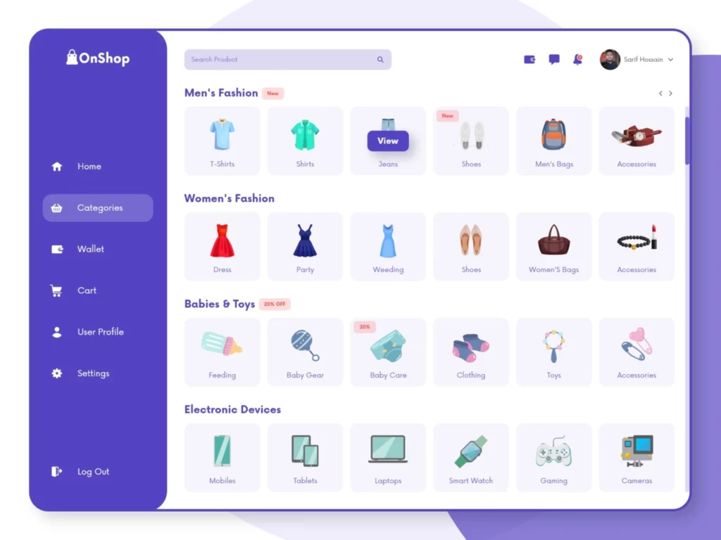
Category pages must be optimized for search engine optimization in addition to being important for user experience (SEO). Incorrect parent-child relationships can lead to duplicate material and lower your search engine rankings. As a result, make sure that each category page:
Has a keyword-friendly, descriptive URL.
There are different texts for each category description.
Fits into your entire information architecture logically.
Additional filters are available for sorting product suggestions.
Product page
For the best ecommerce website design the product pages are critical. Your traffic and conversion stats will never increase if your listings are unappealing, whether you offer t-shirts or tires. At the absolute least, your product page should include the following:
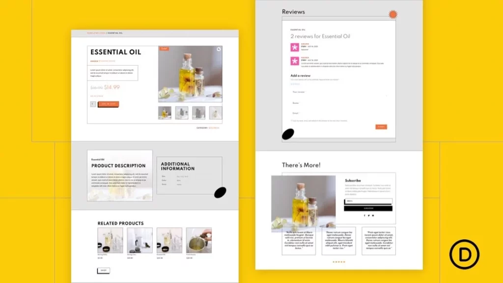
Photo of high-quality products.
Name, color, size, price, and important features of the product
Buttons to buy and save for later.
Description of the product in detail.
Customer testimonials/social evidence
Similar products (upsells and cross-sells).
Then you can add some extra features like countdown timers, video or augmented reality demos, in-store check-in, back-in-stock alerts, and more.
The example product website is stream and user-friendly, providing visitors with a general overview of the company’s products while still allowing for specifics and comparisons.
Checkout page
Most of these can be avoided by improving the design and flow of your checkout page.
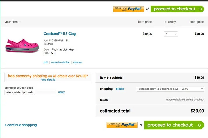
Allow first-time customers to use guest checkout and then prompt them to create an account with you once they finish their purchase.
Reduce the number of form fields that are required. The checkout flow for e-commerce websites has an average of 12.8 fields. However, you can fit all of your customer information within 6-to-8 fields.
List all of the payment methods you accept clearly and concisely (e.g., debit or credit card, Apple Pay, PayPal).
Before they check out, inform them of any possible expenses. Placing a sticky banner advising users of the ‘free shipping’ threshold, including handling fees into product pricing, and applying relevant sales taxes automatically pre-checkout are all options.
About us page
Don’t consider your About Us page as an afterthought, especially if you’re in B2B eCommerce: 52 percent of business customers say the About Us page is one of the first things they look for on a vendor’s website.
There are a variety of approaches to creating an appealing “About Us” page for an e-commerce business:
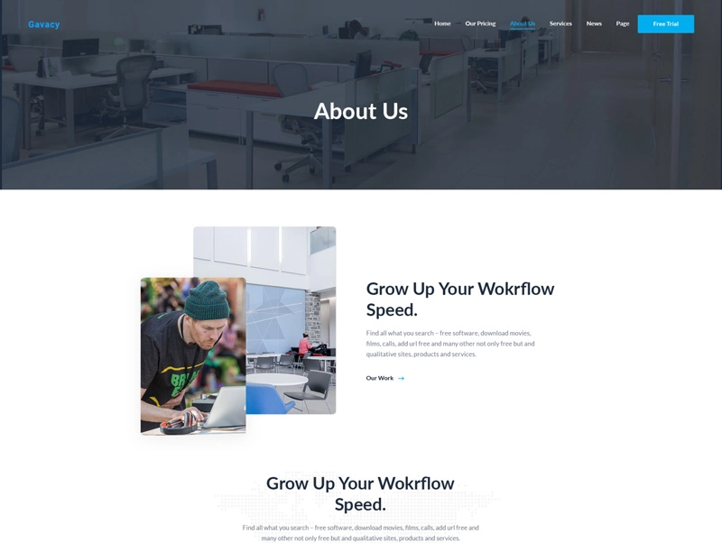
- Tell a tale about the products you’re selling.
- Introduce yourself and your group.
- Showcase your company’s ideals.
- Describe how you work.
- Talk about your background.
- Alternatively, express your vision for the future.
- Keep the language short and to the point in terms of design. To support your message, avoid sales pitches and CTAs and instead rely on the outstanding team and product graphics.
Optimized search engine
For both large and small businesses, an on-site search engine is vital to the long-term survival of an eCommerce website. Any firm must prioritize making the client journey as simple as feasible. An on-site search engine speeds up the customer’s trip by allowing them to swiftly and easily obtain their desired results.

To provide an outstanding on-site search experience, follow these steps:
- Make it easier to find the search bar.
- Suggestions for auto-completes are welcome.
- Give you a list of terms that have been misspelled.
- Analytics can be used to personalize search results.
- Support image searches in addition to text searches.
- When creating an on-site search engine, companies should keep the mobile experience in mind. The search capabilities of an eCommerce site must be suitable for mobile scrolling and capable of handling a smaller screen.
Account login and registration forms
Don’t get too worked up about login forms. They should be quick, smooth, and frictionless.
Request that the shopper first supply basic information (email/password) or connect with one of their social media accounts. Remember that every additional step taken during registration raises the likelihood of churn. Wait until the registration is complete before requesting shipping and billing information. Allow consumers to save and reuse their information in an address book, which would benefit everyone.
A long and confusing login form can turn off a consumer before they’ve even completed a transaction, preventing a long-term customer from making a purchase and removing them from a company’s communication line.
Clark’s account registration is a simple process that is straightforward to locate and use.
Newsletter and opt-in form
A successful e-commerce email marketing campaign can work wonders in terms of boosting your website’s recurring visits and conversions

.However, before you can start marketing, you need to have an email list ready to go. To build your list, consider giving your newsletter a more prominent spot on your website. This can be achieved by using a sticky or pop-up version in the footer to encourage subscribers. You could also offer a small discount for first-time buyers to entice them to sign up.
An excellent example of an e-commerce website that does a great job of this is Jeni’s Splendid Ice Creams. They have placed their newsletter sign-up form front and center, making it easier than ever to sign up. By following these tips, you’ll be on your way to building a solid email list in no time! Additionally, optimizing your email campaigns for SEO can further aid in boosting your website’s visibility and traffic.
Legal website requirements
You must ensure that any eCommerce website you develop is legally compliant with any applicable data privacy rules before launching it. Recent rules, such as the GDPR in Europe or the CCPA in California, have a direct impact on data gathering and utilization, especially for larger businesses. If a website utilizes cookies, it must confirm that users have given their consent.
GDPR and CCPA have already had an impact on eCommerce websites, with global e-commerce sales falling by 8.3% the year after GDPR’s introduction. These can assist you to avoid legal complications in the future and indicate to your customers that your site is compliant.
Each organization must set up the following three things before launching a website to assure compliance:
- Privacy policy page
- Terms and Conditions
- Disclaimers
Lesson learned
Designing an e-commerce website is more of an art than a science. The goal is to constantly develop a store homepage with high-quality information and simple navigation. Making your unique selling proposition clear, showcasing your products with eye-catching photos, and encouraging social sharing are all ways to achieve this goal.
It’s now easier than ever to create the best ecommerce website design. Many large and small businesses were previously unable to participate in the Internet marketplace due to an exceedingly technical and time-consuming approach.
Good eCommerce website designs are readily noticeable. They usually rely on five main components:
- The reputation of the brand is well-established.
- The navigation is simple.
- Information architecture that works.
- Product landing page optimization.
- Easy Checkout.
While they may appear to be easy, they are frequently anything but. The site may have simple navigation, but if your pages are unattractive or distracting, you won’t keep customers on it for long. To build the best ecommerce website design, each of these five parts relies on the others. After reading this post, we hope you understand the essential need for the best ecommerce website design lastly, Do you find this information useful give your feedback and queries about the business solutions to the Ecommercefix team in the comments section Good Luck!
Valuable information. Lucky me I found your site by accident, and I’m shocked why this accident didn’t happened earlier! I bookmarked it.
A person essentially help to make significantly articles I’d state. This is the very first time I frequented your website page and so far? I surprised with the research you made to make this particular publish amazing. Great activity!